Con l’introduzione di Windows 10, il menu hamburger – che in molti non riescono proprio a digerire – è stato ormai sdoganato facendosi spazio nell’interfaccia Metro, è un dato di fatto. I motivi sarebbero pratici, più che stilistici.
Un ex designer di Office ci spiega il perché della scelta, sostenendone la validità e illustrando alcuni punti a favore del menu hamburger:
“Windows Phone’s original interaction model put actions on the bottom and navigation on the sides, as swipes. That’s not a great pattern for a variety of reasons.
iOS started with a lot of apps using tabs on the bottom, and over time started aligning more with Android, who put a few key actions on the top, then a “swipe back” pattern for more options. Think of Mail on iOS, how you go into a message, then you can swipe from the left to get back to your inbox.
Windows Phone was left in an interesting spot. Many of us believed that the old interaction model just wasn’t going to work. You can’t stick navigation in a horizontal direction. It’s part carousel, part “mystery meat navigation” and it just doesn’t work. So. We needed to figure out what the new model would be.
Putting a title bar on the top was the first important step. If you’re in Word and you can’t see the name of your document, that’s not good. So, ok, put a bar across the top. And now you have a bar across the top you can provide a back arrow in the top left to get back to your documents. Awesome.
Then you put the ribbon in what I called a “palette” or “drawer” on the bottom, and on the top right you can start putting “hero actions.” I argued for only one but I’m unsurprised that they ended up with more.
So there you go, right?
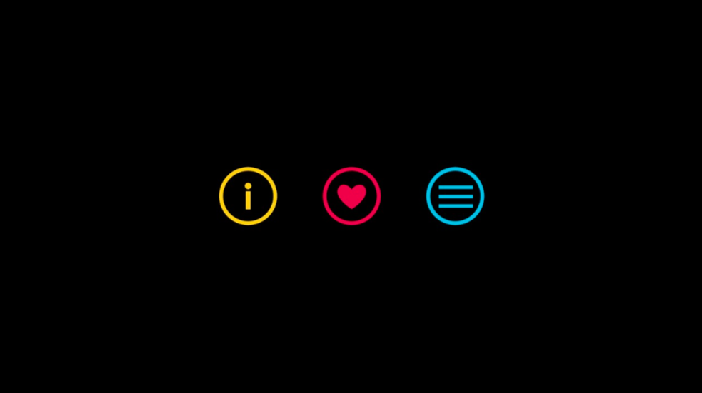
Top: Name of document common actions
Bottom: Three dots to get the ribbon in palette form.
The problem is, there’s just way too many things on the top bar. For example, you might want to print. How do you do it? Well, you could design a print icon in the top bar. But it’s probably not worth it. You could hide it in the ribbon, but that sort of sucks for discoverability.
And then you notice the top left corner. And you think “Well, tons of Android apps just put everything there. Maybe we could try that?”
And so it became clear, due to the massive number of features in Office apps, and the extremely tight real estate, and alignment with tablets, that a hamburger was the best overall pattern.
Uno dei problemi dell’interfaccia Metro sarebbe lo spazio a disposizione. Quando gli swipe non sono adatti e si hanno app con molte funzionalità, quando quindi il menu a tendina posto in basso non basta, l’alternativa più immediata si troverebbe proprio nell’angolo in alto a sinistra. Questa scelta sarebbe stata presa già su Android e iOS per gli stessi motivi.
“Swiping sucks. It hides content. Let’s say you’re in Format and you want to get to something 5 tabs away. Five swipes is an unacceptable series of interactions. The carousel model has been disproven repeatedly, every single decade, for several decades. We have the data. It’s a dumb interaction model, full stop.
It turns out bottom is not better. You’d think that something 3 pixels from your palm would be easier to reach than something in the middle of the phone. But nope. The way average people hold phones means the middle of the device is the best location. Both bottom and top require your hand to make a bit of a shift to reach. (this is why swiping on items to get options like “flag message” or “delete” is popular. Make the gesture contextual to the item itself and you don’t make people reach to use it. And this is, again, why reserving swipe at the app level for navigation is not a good model.)
You don’t use the hamburger very often. Most of your time is spent reading, and then some of your time is spent manipulating the content. So if we put the hamburger on the bottom (which no major app in the whole industry does) then the app bar on the bottom would have to get larger in Office. And in the case of Outlook, you’d have to actually put a bar down there in the first place.
Once you have an app bar again, in order to put the hamburger, you’ll want to use that space. So maybe you put status down there. Maybe you put refresh. Maybe you put compose new. Well maybe you don’t need the top bar anymore!
Except you do. So you know what folder you’re in. (and in other apps, what document you’re looking at, or whatever) So the choice is either “Align with the rest of the industry by putting the bar on the top with some key actions and a hamburger” or “Put chrome on the top and bottom” or “Lose the titlebar at the top, putting it at odds with every mobile OS on the planet.”
Il menu pivot nasconderebbe elementi agli utenti, da sempre. Stesso discorso per la tendina in basso che non risulta di facile accesso per funzioni che si utilizzano frequentemente. Con app con molti pulsanti posti in basso, il menu hamburger posto in alto può essere utile per funzioni secondarie.
“This isn’t a popular opinion on this particular forum, but the interaction patterns in Android and iOS are better designed (at least compared to 7). You can disagree, you can say I’m a fanboy, whatever, I don’t mind.
But get into the labs and watch people use all three platforms. There’s data here that not everyone is privy to, but that doesn’t make it less true. There are some real weaknesses in the old Metro patterns.
But point taken. Maybe iOS and Android forced everyone to two handed use with shitty design. Which came first, the bad design or the coping strategies?
Well, in this case we have an answer. Big screens exploded in popularity. (I argued against big screens for a long time. I was 100% wrong.) By the time you say you’re ok being a tiny South Korean teenager with an eight inch phablet, the ship has sailed. You’re going two handed.
And again, as I’ve said elsewhere, the hamburger is for lesser used things. The most common usage pattern, by far, is scrolling through content and reading it. So as long as you can thumb around, you’re happy. All that other shit should be easy to use, but top left is much less of a problem than it sounds like it might be on paper.
I was out for coffee with a Windows PM a few weeks ago and she said “what do you think of the hamburger?” And I’m starting to piece 2+2 together. Apparently there’s a big hamburger backlash brewing in the Windows community that I wasn’t aware of.
But here’s a design challenge. And I’m serious – when Excel comes out, download it and see everything in the hamburger. Then redesign it. I’m curious to see what people come up with, because I’m always ready to see more ideas. We went through a ton but that doesn’t mean we could have thought of everything.”
Secondo l’ex dipendente Microsoft, il menu hamburger non sarebbe una tragedia. Con il crescere delle dimensioni dei device, parlare di uso a una mano è sempre più difficile. Il menu hamburger dovrebbe essere utilizzato solamente per funzioni secondarie.
Al momento sembrerebbe che Microsoft stia ancora decidendo quale design language adottare, ma la nuova interfaccia mista sembrerebbe la via già intrapresa per alcune app di Windows Phone 8.1 e in alcune di quelle nuove di Windows 10 Mobile. Voi che ne pensate?
Articolo di Windows Blog Italia
Fonte | Reddit